Saturday, April 02, 2011

3D printer


On 31 march, the MIAT museum hosted an event about 3D printing. The idea of event belong to department of Applied Engineering of Hogeschool Gent.

RepRap in action.

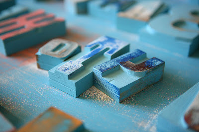
test letters printed from different materials.

got freshly printed letter in my hands:)

unfortunately the surface of the printed letters is not perfect yet, (but we all knew that, anyway:)

Thursday, March 31, 2011

Pure Reversal

PureReversal from Build on Vimeo.


'Pure Reversal' is a short film produced by Build for the launch of the new typeface 'Nokia Pure' (created by Dalton Maag). Bridging digital to analogue Build commissioned a woodblock version of the typeface, highlighting the craft of Matt McKenzie of the Paekakariki Press.

Filmed on location at his workshop in Walthamstow, a ltd-edition print was produced and printed on his original 1959 Heidleberg KS Cylinder 38 x 52 Press.

source

found via Erik Desmyter

Monday, March 28, 2011

Wood Type


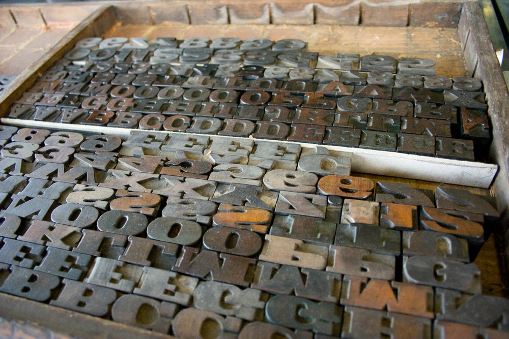
This entire weekend I spent at the museum, sorting out the wood type (50+ letter cases). It took me some time to find all missing pieces and organize everything alphabetically. But I had a great fun!

Wood Type


Now, the next step is to identify each one of them, as there is no records at the museum. Something tells me it will take much more time than just sorting it out:)

Sunday, March 27, 2011

Letterpress (second edition). David Jury.


After a succes of 'Letterpress:New Applications for Traditional Skills' in 2006, RotoVision has released a second (updated) edition - 'Letterpress: the allure of the handmade'.
'Newly revised and updated with luscious and inspiring images of contemporary work, this book allows today’s graphic designer to rediscover the creative potential of letterpress. Thanks to its physical presence on the page, letterpress has a unique and visual impact, and offers a powerful means of expressing ideas through a more intelligent use of type.'

found in RotoVision Catalogue

Sunday, March 20, 2011

Memory game


"Built Icons" memory game is a wonderful result of craftmanship of Marcel Gohring from Druckwerk printing studio in Basel. This game box includes 48 letterpress printed cards (each card is designed using wood and metal ornaments) and a folder with impressive photos of lock-outs (I can imagine how time-consuming it might have been). The entire box is available for purchase here. On my wish list!

found via letterology

This type illustrations slightly reminds me of work by Almost Extinct.

Saturday, March 19, 2011

Blog


Yesterday I came across this interesting tumblr blog. It is dedicated to the art of print-making, no matter what techniques has been used.
A lot of inspiration out there!:)

found via printeresting

Saturday, March 12, 2011

Get Up Printing Kit


Love the idea of handmade stamps for Barcelona based 'Get Up Hair' stylist. It's fun and flexible!

made by Alexis Rom Estudio

Saturday, March 05, 2011

Oakland wood


These wonderful wood letters of Oakland (by Zuzana Licko) were created by Evan Christie (School of Visual Concepts, Seattle, WA). "Typefaces of the past, many of which are now staples of modern graphic design, took physical form as moveable type," said Evan. "I wanted to use a typeface that was never meant to take physical form, and Oakland was the perfect typeface to use because it embodies the birth of the digital era where nothing is tangible." Christie milled the maple down to type height and etched the letters in long strips using an epilog laser engraver. They were then cut off the strip into individual blocks.

source

I'm curious about the prints:)

Wednesday, March 02, 2011

Letter March


Letter March is an interesting project by Aymie Spitzer, a graphic designer located in Brooklyn, New York.
'This is an experiment in carving one linocut letter per day in an attempt to complete an entire alphabet by March 31st. Chosen typeface: Champion Gothic by Hoefler & Frere-Jones.'

Looking forward to see more lino carved letters.

Monday, February 21, 2011

Making Books


This nice video, produced by Encyclopedia Britannica Films Inc. in 1947, shows laborious process of producing books. Amazing!

Sunday, February 20, 2011

Книга Букв (The Book of Letters)


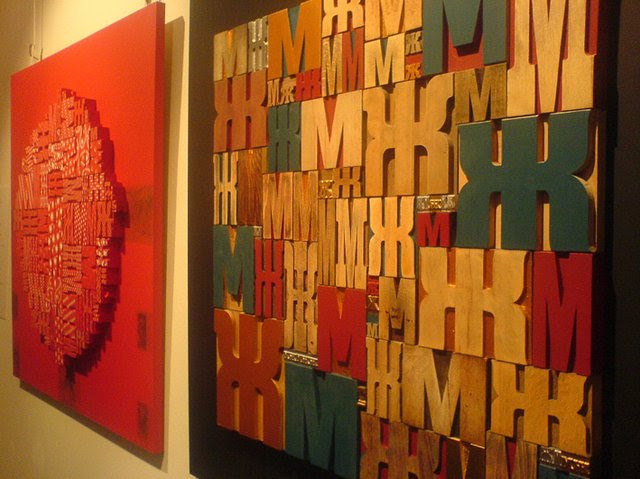
While surfing on we love typography I've spotted some interesting images of cyrillic wood type. Apparently those images are coming from an exhibition in Moscow called 'Книга Букв' (The Book of Letters). It has been orginized by designers Maxim Gurbatov & Anna Tsjaikovskaya.
In this exhibition there are texts and images. But the images of this book are to read and the text - to watch. Here is the story told by authors: "Once upon a time we stumbled upon wood characters. They were laying on the dusty pavement near the gates leading into the printing house. For us, to found a dozen of old wooden letters was like to become an owner of map that leads to the Treasure Island. So the letters hunt had began! It became immediately clear that in Moscow there was nothing to find. So we brought six bags of letters by truck from the printing house of the 'Pravda Severa' newspaper, from Archangelsk. We orginized this exhibition because we wanted to show that letters are beautiful, they combined art, technology and literature, and if their service in the printing industry is over, then their place is in the art.'

exhibition is open from 16 to 28 februari at 'Mars' Gallery, Moscow (map)

I wish I was there…

click here for more pictures

Thursday, February 17, 2011

Almost Extinct


'D' is for duck

'Z' is for zebra

Just came across this lovely project by Almost Extinct.

'Back in the day wood and metal type revolutionised the creative industries. With the introduction of new technology many type houses now face extinction. Today it is easy for anyone to manipulate typefaces and design layouts.
'Almost Extinct’ is a project that seeks to rediscover this ‘craft’. The idea is to source leading experts in this field to help design and print an alphabet of animals without the use of a computer. Some of the designs require many passes of the printing press with letters at various angles. Others require overprinting with a precise weight of ink. All of them require the sourcing of the perfect wood or metal letters, that should ideally suit the scale of the animal.' Once they will have all the animals they will hold an exhibition of prints with the sourced letters that were used next to them.

Looking forward to see more typo-animals:)

read more about the project

Tuesday, February 15, 2011

Drukwerk in de marge


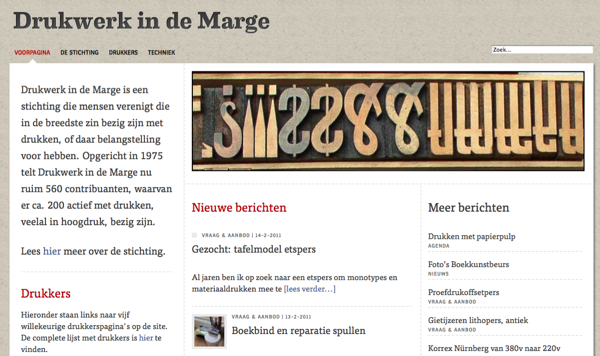
Recently I came across a very useful website - 'Drukwerk in de marge' (in Dutch). 'Drukwerk in de marge' is a foundation that unites people engaged in printing. Founded in 1975 it counts now more than 560 contributors, of which approximately 200 are active printers (mostly in The Netherlands).
On the website you can also buy & sell letterpress (and other printing related) materials.

link

Monday, February 14, 2011

letterpress wallpaper


This typology wallpaper from Wall & Decò seems to be three-dimensional, an optical illusion that gives the impression that the wall consists of type blocks. Nice idea.

found on the style files

Adana test


Recently the museum (MIAT) both a smaller printing press - Adana 8x5 (in quite good state). I never worked on it before (always worked on bigger presses), so I spend a couple of hours testing it. It was fun! I produced a lot of missprints:) I still need to find a balance between ink quantity and practice more.

Wood type


On sunday I started to arrange the wood type collection we have at the museum. I realized I completely underestimated the work that I've been planning:) The collection is spread over various typecases and it is a challenge to find the missing pieces. I hope (with some help of colleagues) I can finish it by this summer. The next step will be printing the specimens.

to be continued

Saturday, February 12, 2011

Type cabinet


This will be a future 'home' for a part of woodtype collection at the museum (I'll be posting some examples later). Like the typography on it, but still don't understand what it has to do with beer:)

Film poster. Februari


test n°2

Second day at the workshop. I've made some changes and printed some tests. Not entirely happy with the outcome, so I will be working on it tomorrow. Noticed that the wooden letters and lines has completily different heights, so I need to adjust almost everything:)

Sunday, February 06, 2011

Film poster. Februari


test print

This year, after a long break, I'll be able to visit the printery more often. So yesterday I started a new project - film posters, which I will be doing each month. Films are shown in a very special location at the MIAT museum and the next comming film is one of my favorites - 'Les vacanes de M.Hulot' by J.Tati.

more images next week

LinkWithin

Blog Widget by LinkWithin